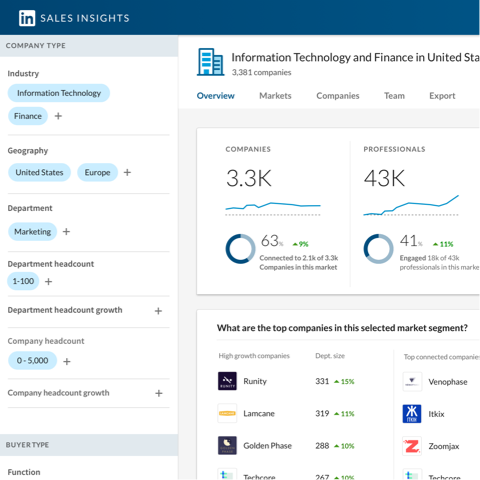
Overview
Inkling customers consistently voiced a need to compare usage across content, typically to make strategic decisions about the company's learning curriculum.
Role
As the product designer on this project, I worked closely with a product manager, product researcher, and engineer. I was responsible for design principles, early concepts, interaction details, and visual design.
Process
Our team started with rounds of discovery research to clarify the business problems before diving into design work. The process involved data prototyping with sample data, customer validation, and a final design sprint.
Design Discovery
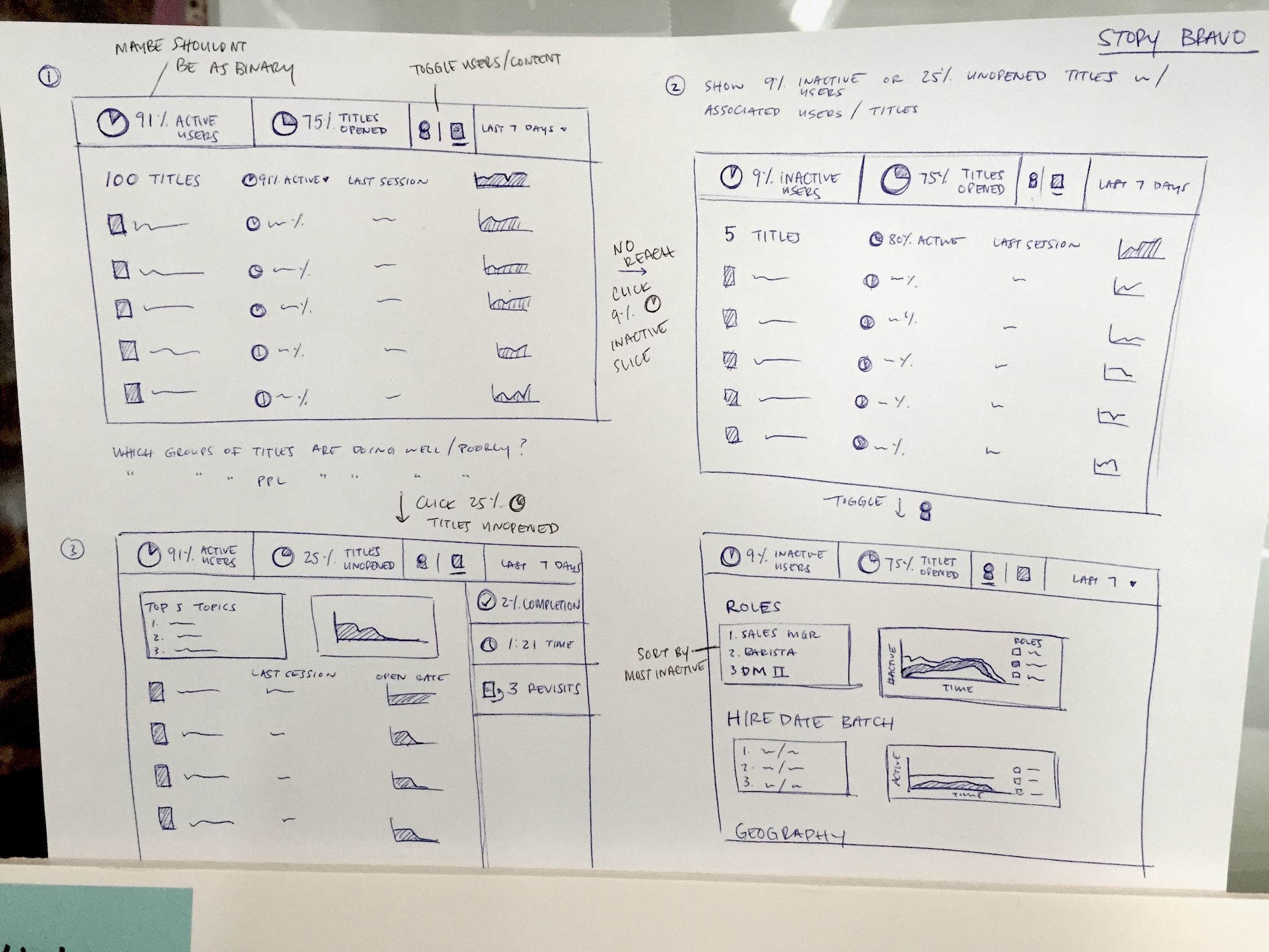
Based on what we knew about the problem, I conducted an initial design sprint to explore ways to show meaningful metrics. This concept served as an early discussion point for design and research sessions.

Generative Research
To fully understand the problems our users were dealing with and how data could help, we spoke with 12 customers. In these sessions, we focused on understanding the problem space of content analytics specifically in a learning context.
Personae
The Director of Learning is in charge of creating and managing the learning program for the company. Training Managers enforce curriculum for a division and directly manage the learning of a team or several teams.
Questions
During research, we asked questions like: What sorts of initiatives do you have planned? What type of information helps you achieve your goals? What would your next step be after finding this information?
"What is the reach and effectiveness of my company's learning program?"Quote from a Director of Learning during a research session
Theme: Reach
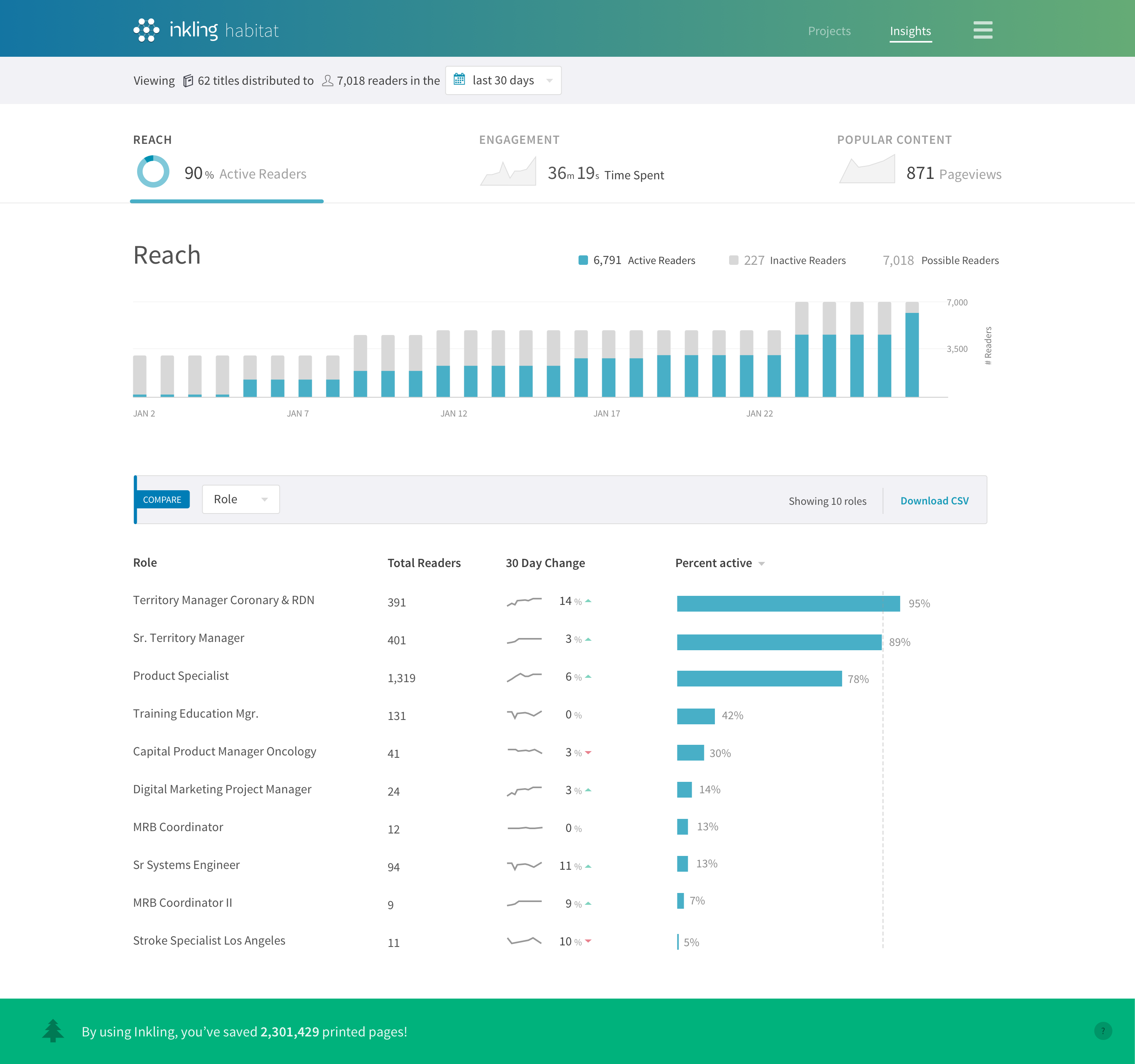
Are people reading content at all? If not, what do I need to do to market the program? Who do I need to talk to?
Metrics: active readers, inactive readers, metrics over time.
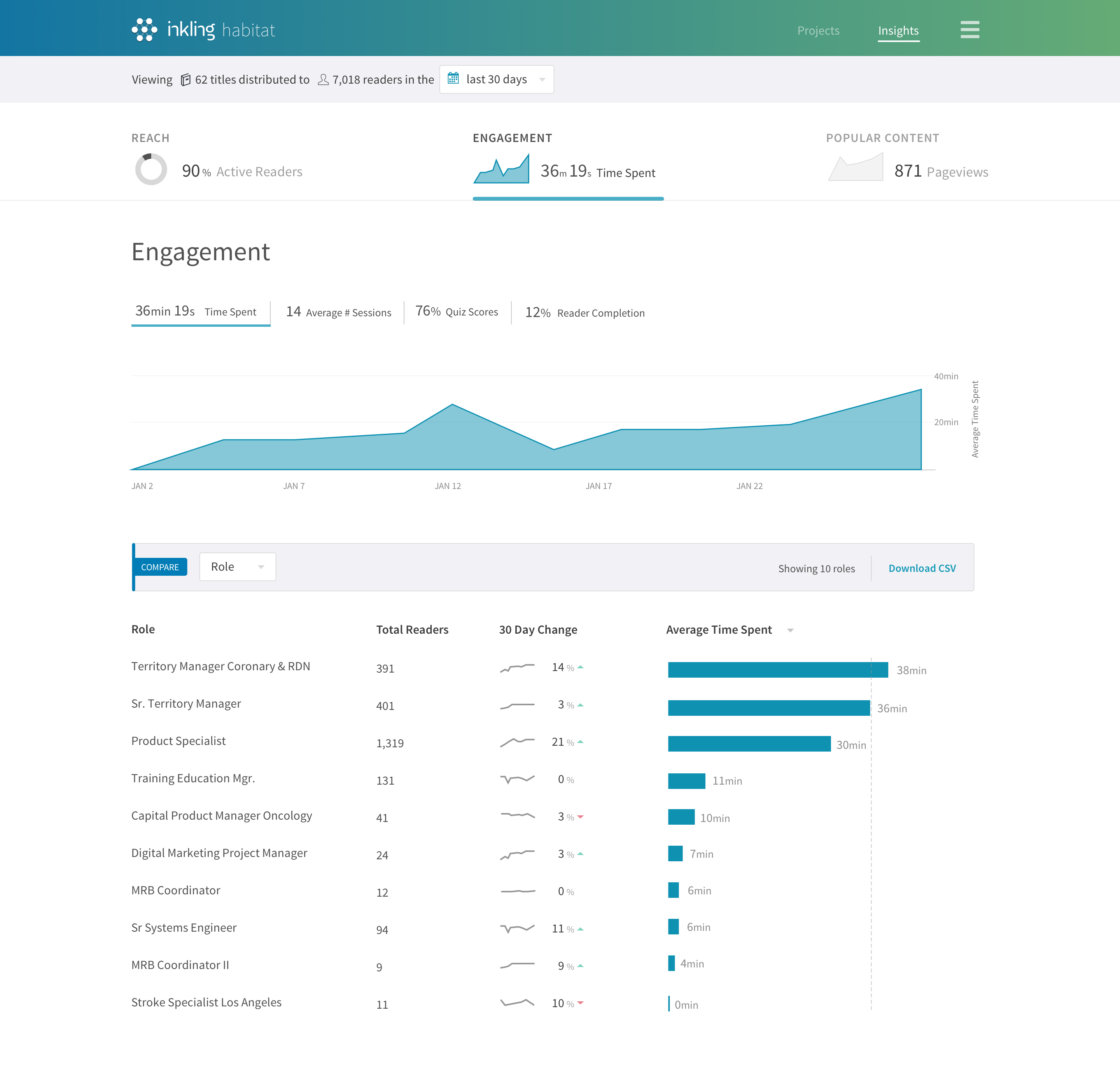
Theme: Effectiveness
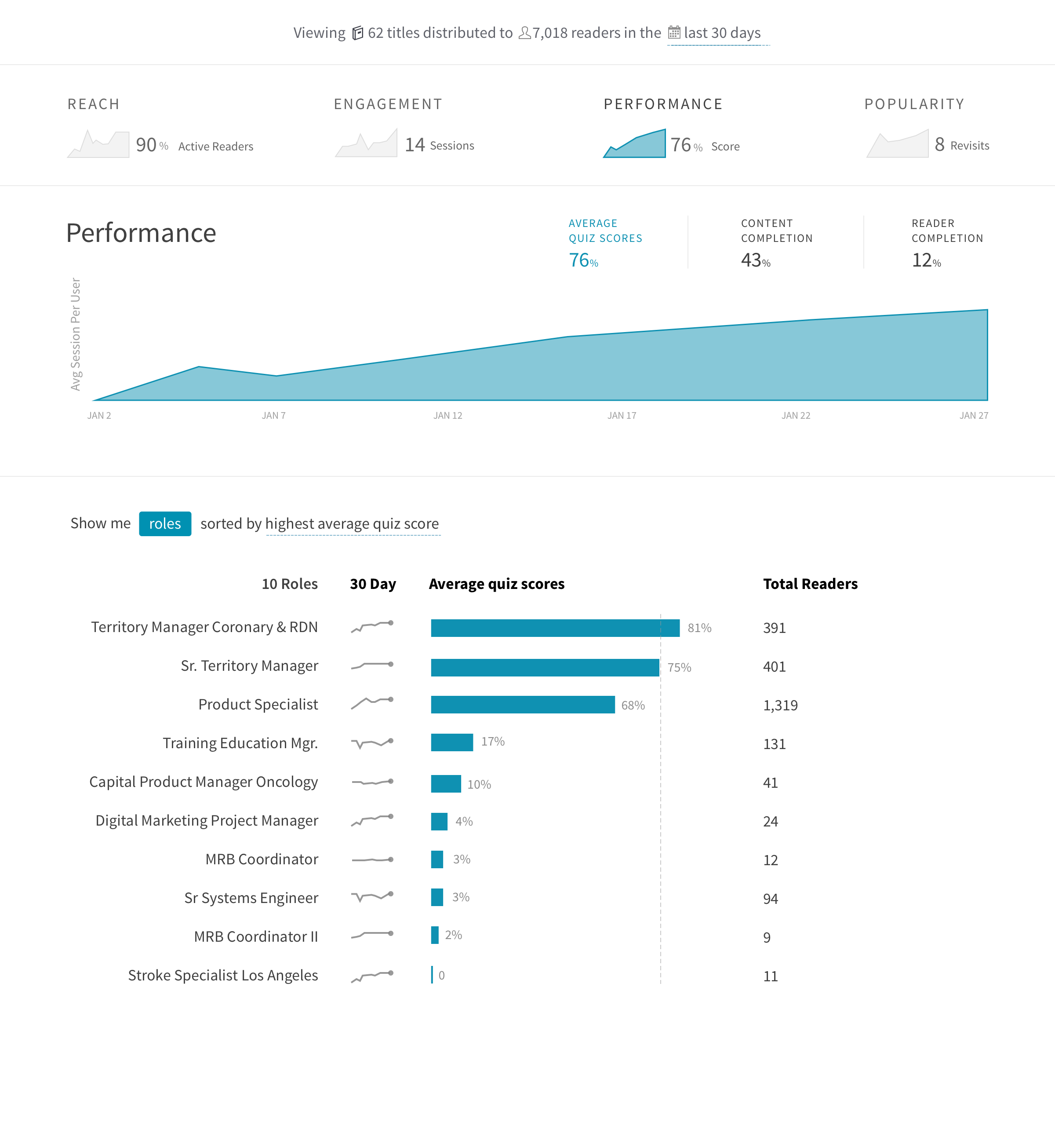
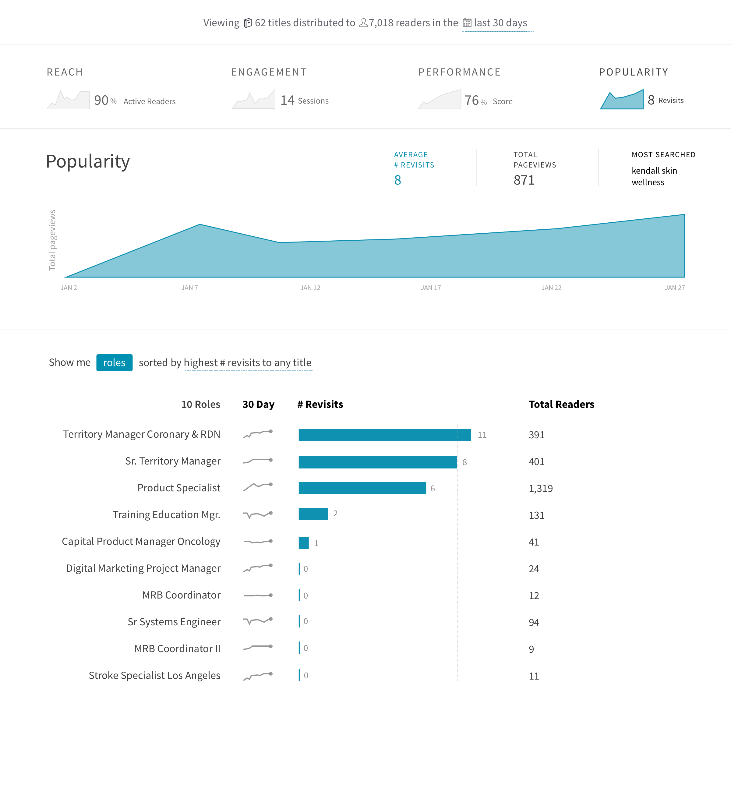
If people are using the content, how engaged are they and which pieces of content are most effective?
Metrics: performance, time spent, raw data via CSV.
Competitive Analysis
I explored a dozen different data visualization products with the goals of exploring layout possibilities, methods of filtering, metrics, and types of aggregation. Others included: Quickbooks, Tableau, Mint, Coursera, various NYTimes visualizations, Chartio.

Google Analytics handles the most number of metrics and has a way to segment users, but has a confusing IA.

Fitbit is an interesting consumer analogy that has a goal to motivate users.

Square Insights excels in visual design, focus on real business problems, but also struggles with the perfect IA.

Khan Academy showed us interesting methods of visualizing learning and content completion progress.
Sketch Discovery
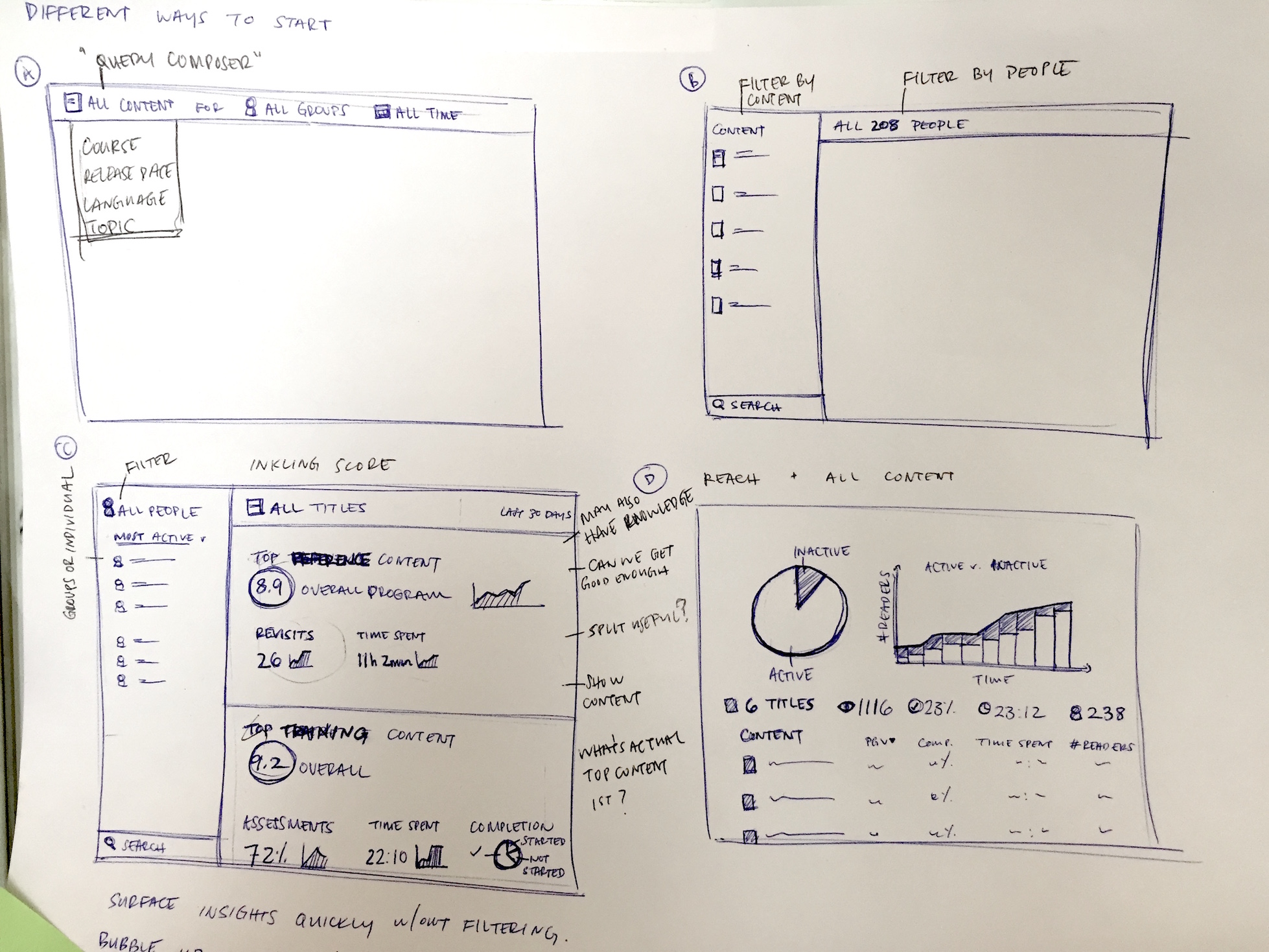
Based on generative research findings, competitive analysis, and team discussions, I explored a dozen ideas focused on solving the business problems we encountered.
-
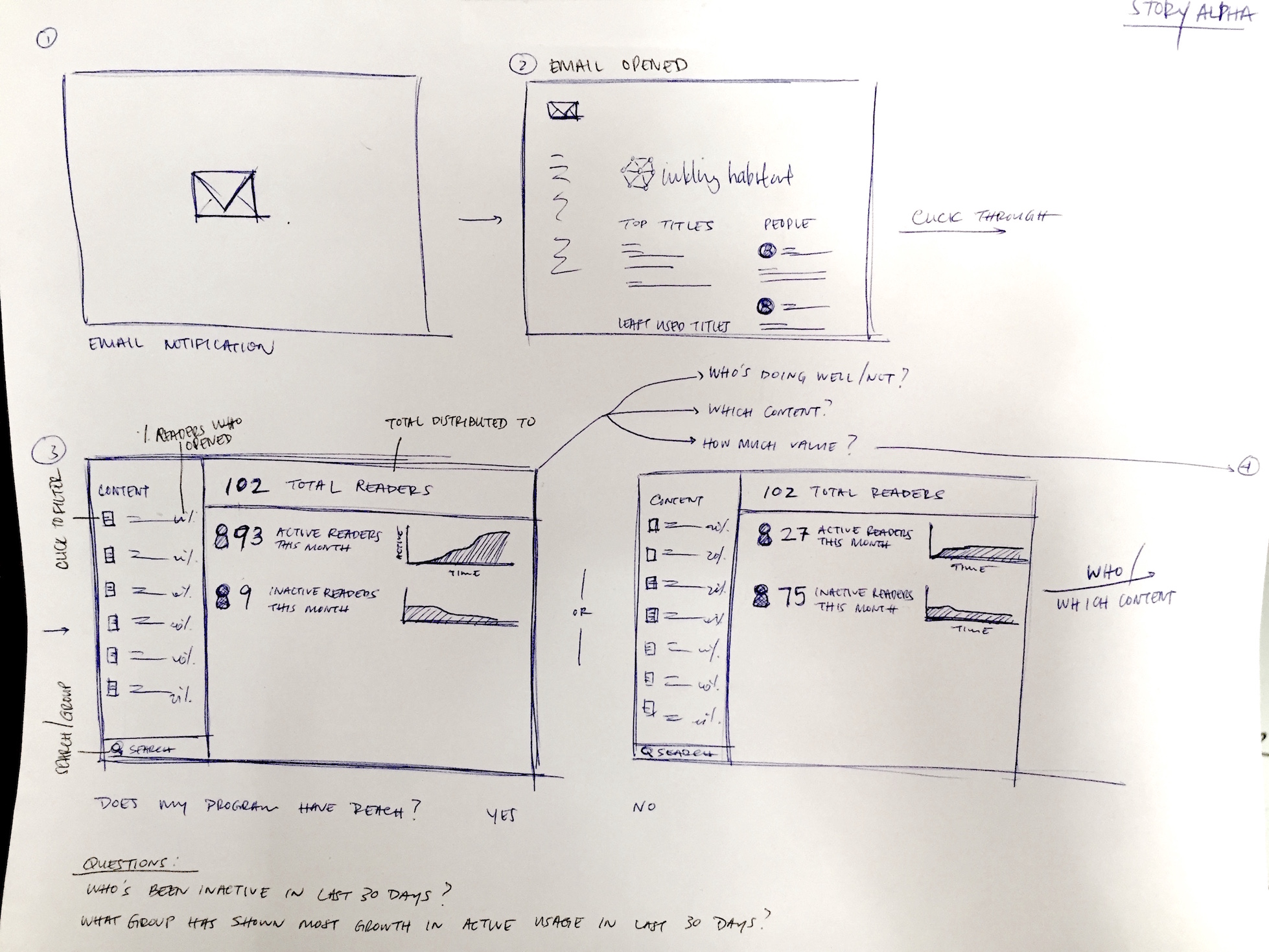 How might users access Inkling Analytics?
 -
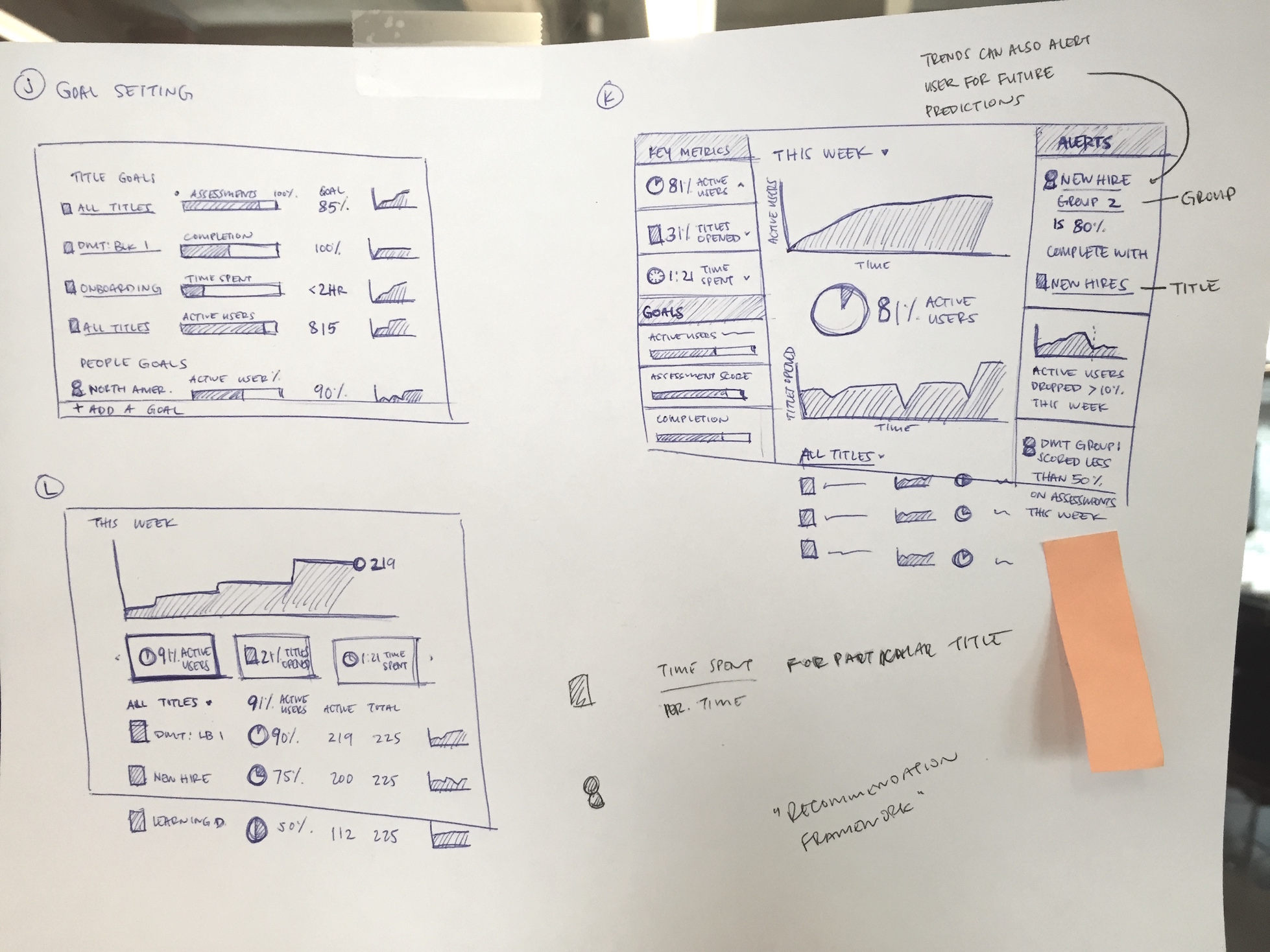 Mint inspired a goal-based approach and alerts when thresholds are met.
 -
 How might we summarize data so users can make decisions at a glance?
 -
 What's the right model for navigating data granularity?
 -
 How will the user filter dimensions and metrics?
 -
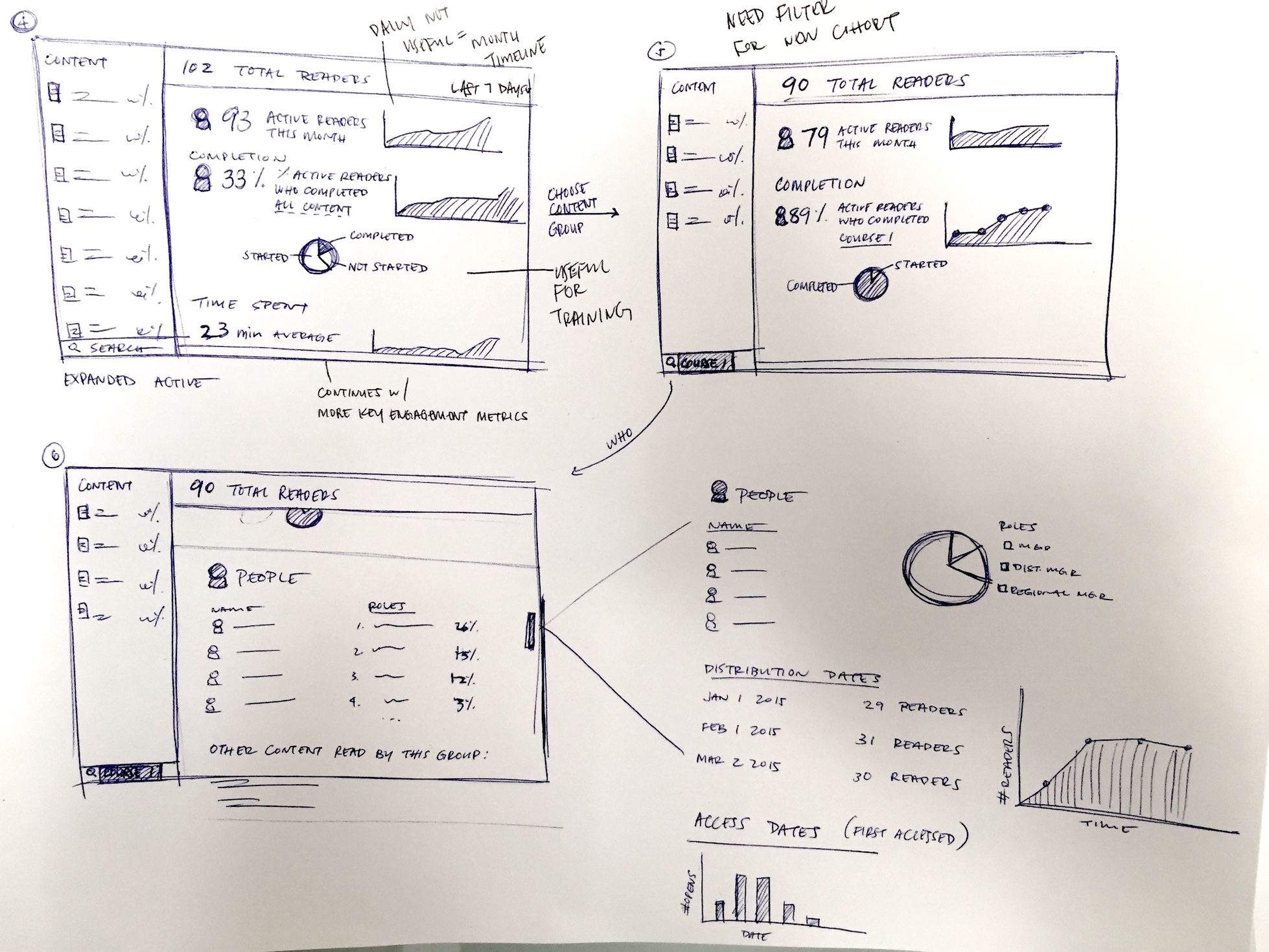
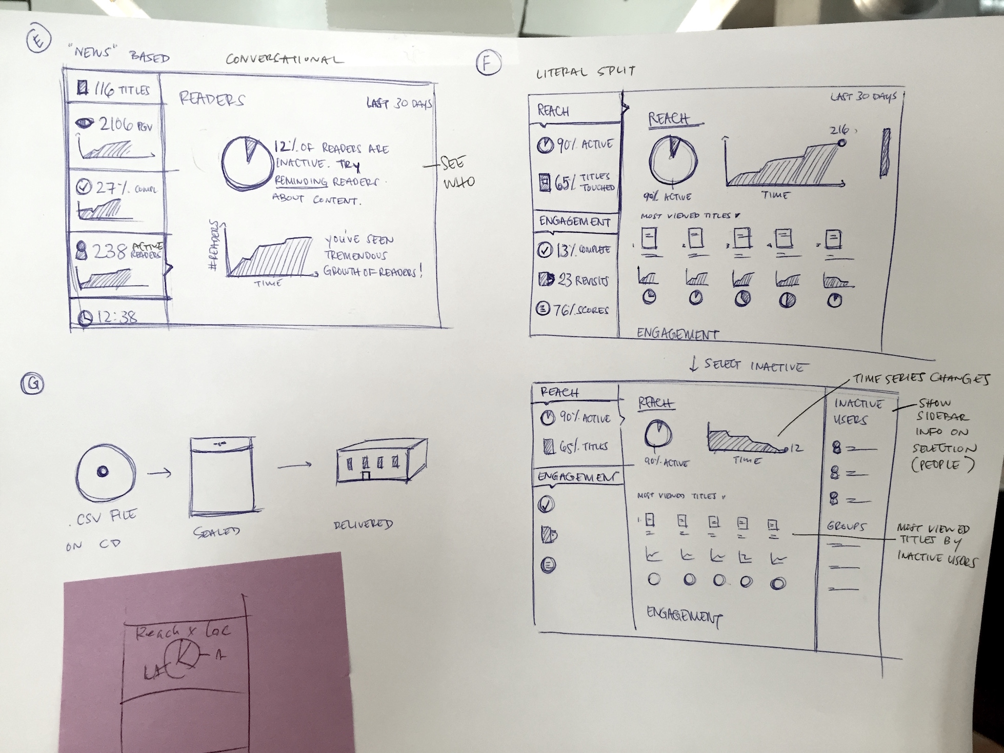 Explorations in layout and level of data.
 -
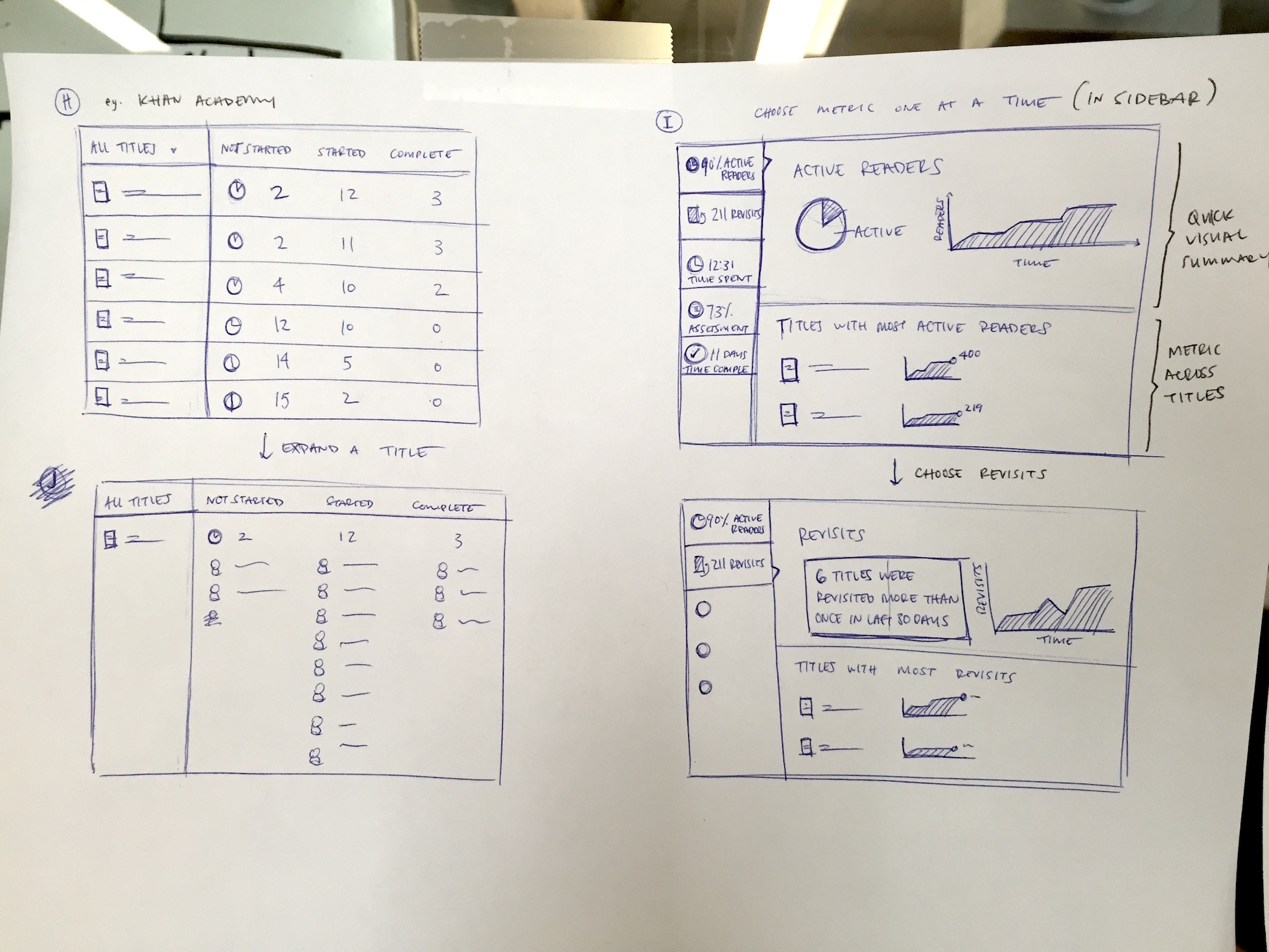 Concepts exploring how users might navigate between metrics.
 -
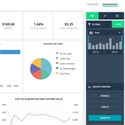
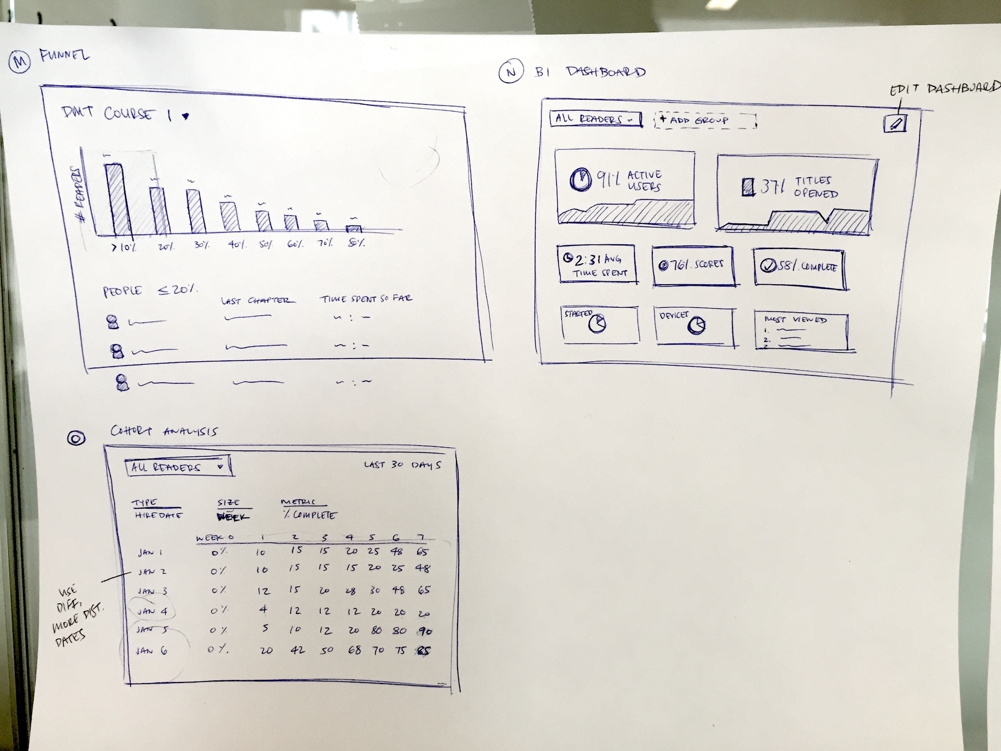 Traditional dashboard concepts including a BI dashboard and funnel metrics.
IA
Finding the right information architecture was an important step in the design. In a business context, it's important to get a high level overview before diving into actionable data. This layout was directly inspired by an article I read.

Design Validation
After reviewing design discovery output internally and testing externally, I created another round of designs that started to address the layout, navigation of data, and visualization of data.

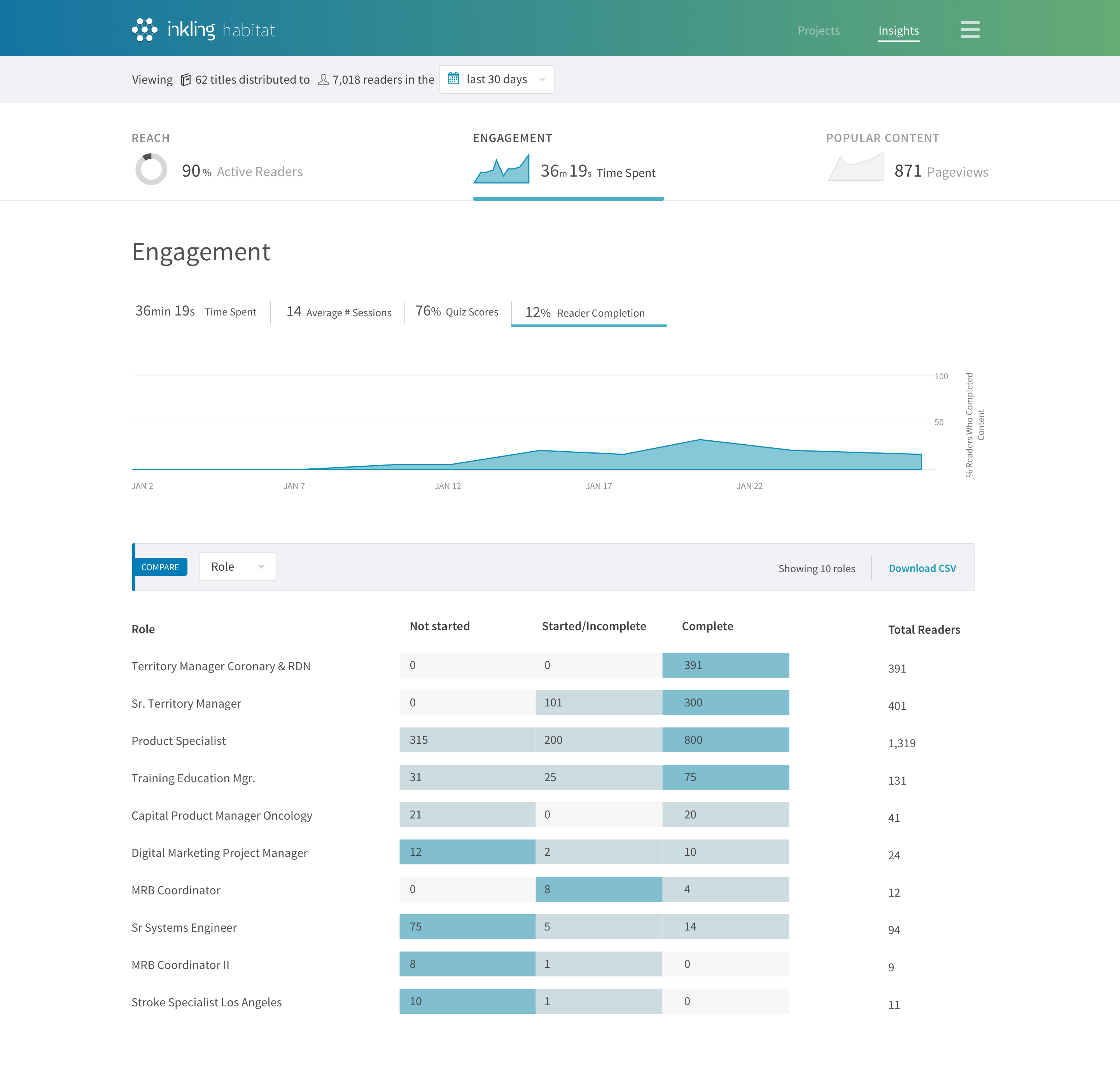
Summarize data
Design reviews and user feedback from this mid-fidelity round suggested a need to see more summarized views of the metrics rather than seeing raw percentages in the sidebar.
The right metrics
These were indeed the metrics users needed to see and the correct dimensions (roles, location, titles) to group by for training managers to get their job done.
Information Architecture
In general, this type of IA and layout tested well against other concepts: an overview to start, page summary, and actionable lines of data that dive into more granularity.
Mid Fidelity
Once we found strong signal from design validation, I dove into more details in design to explore data visualization, information architecture, and filtering.

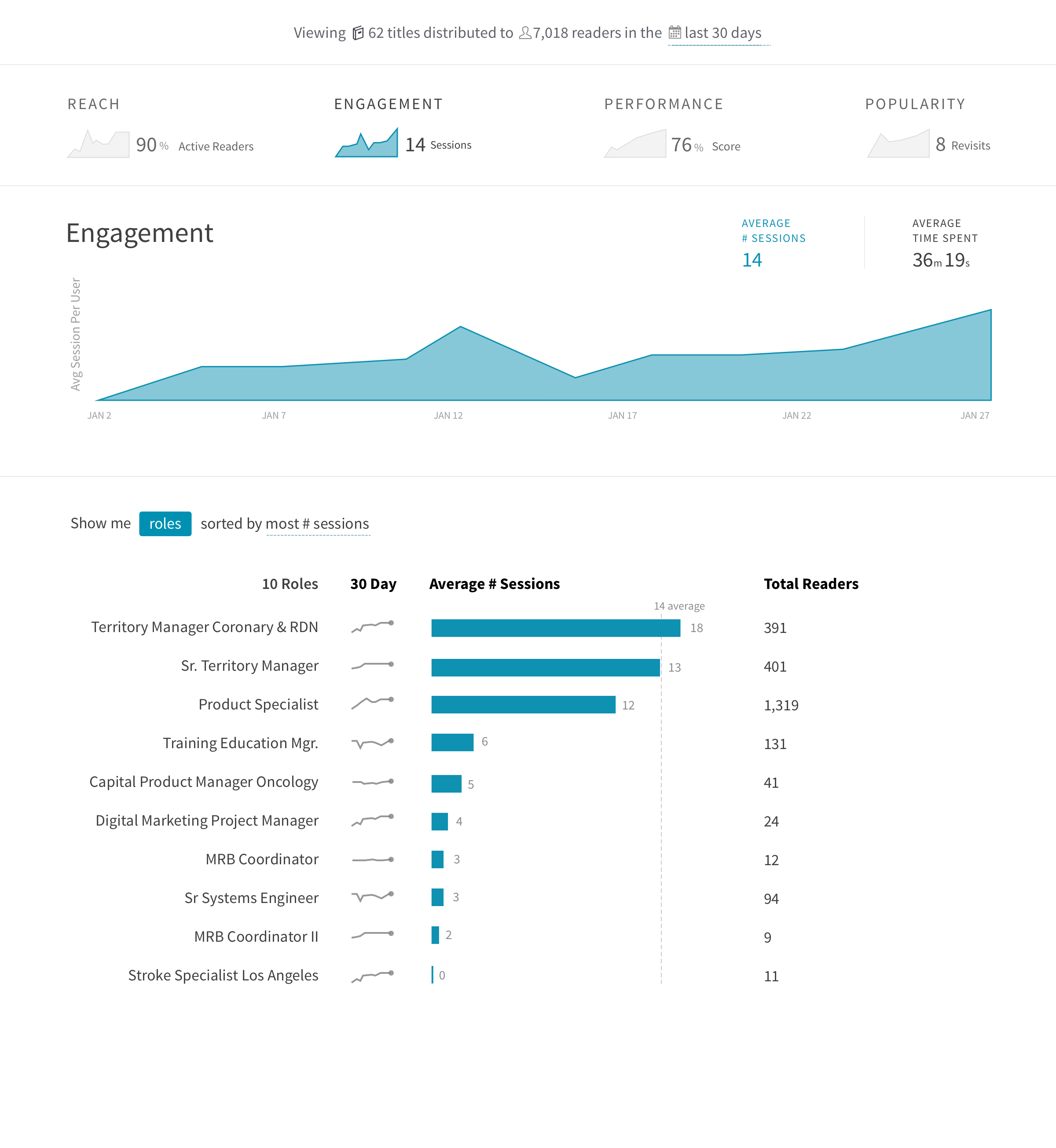
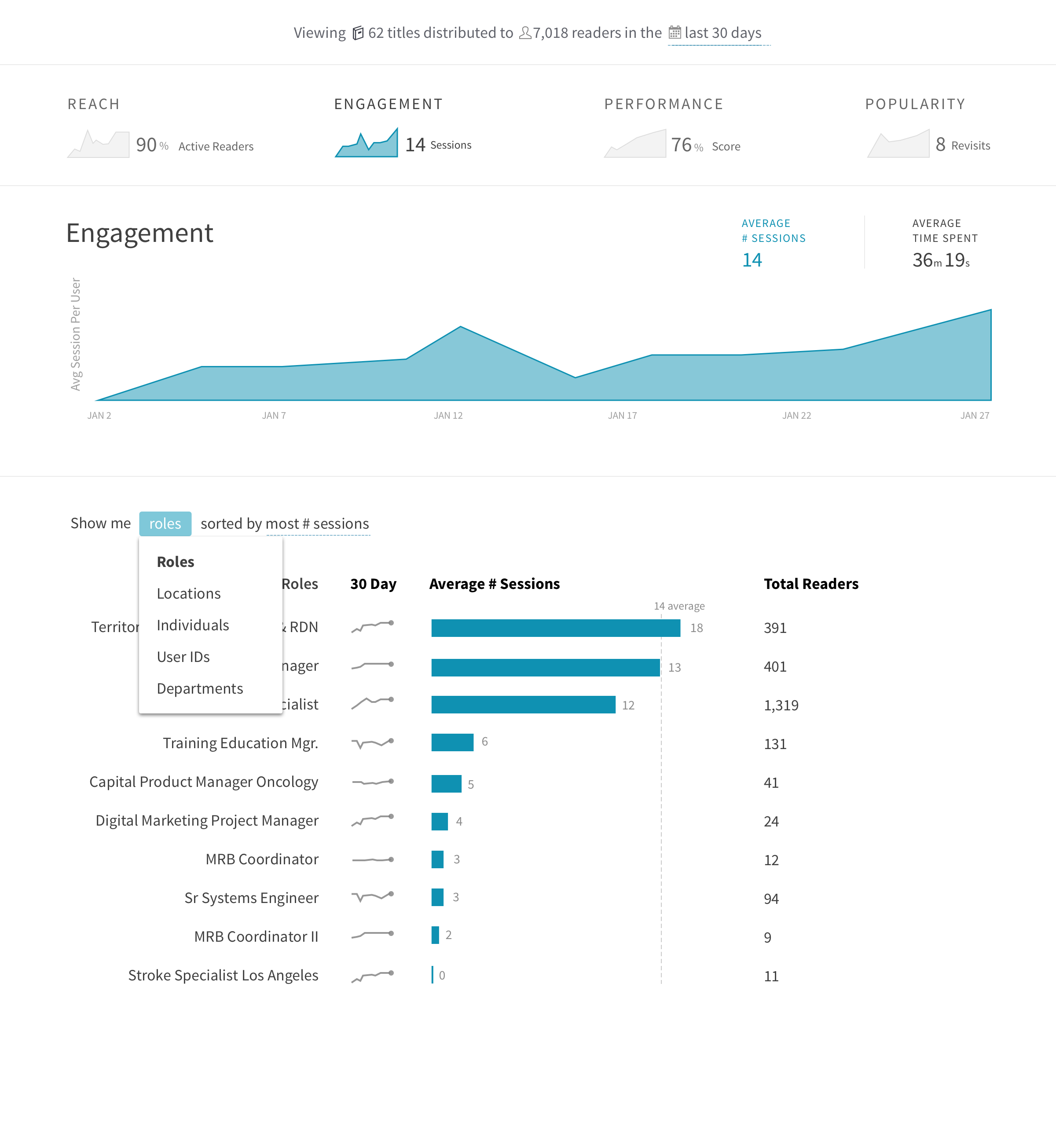
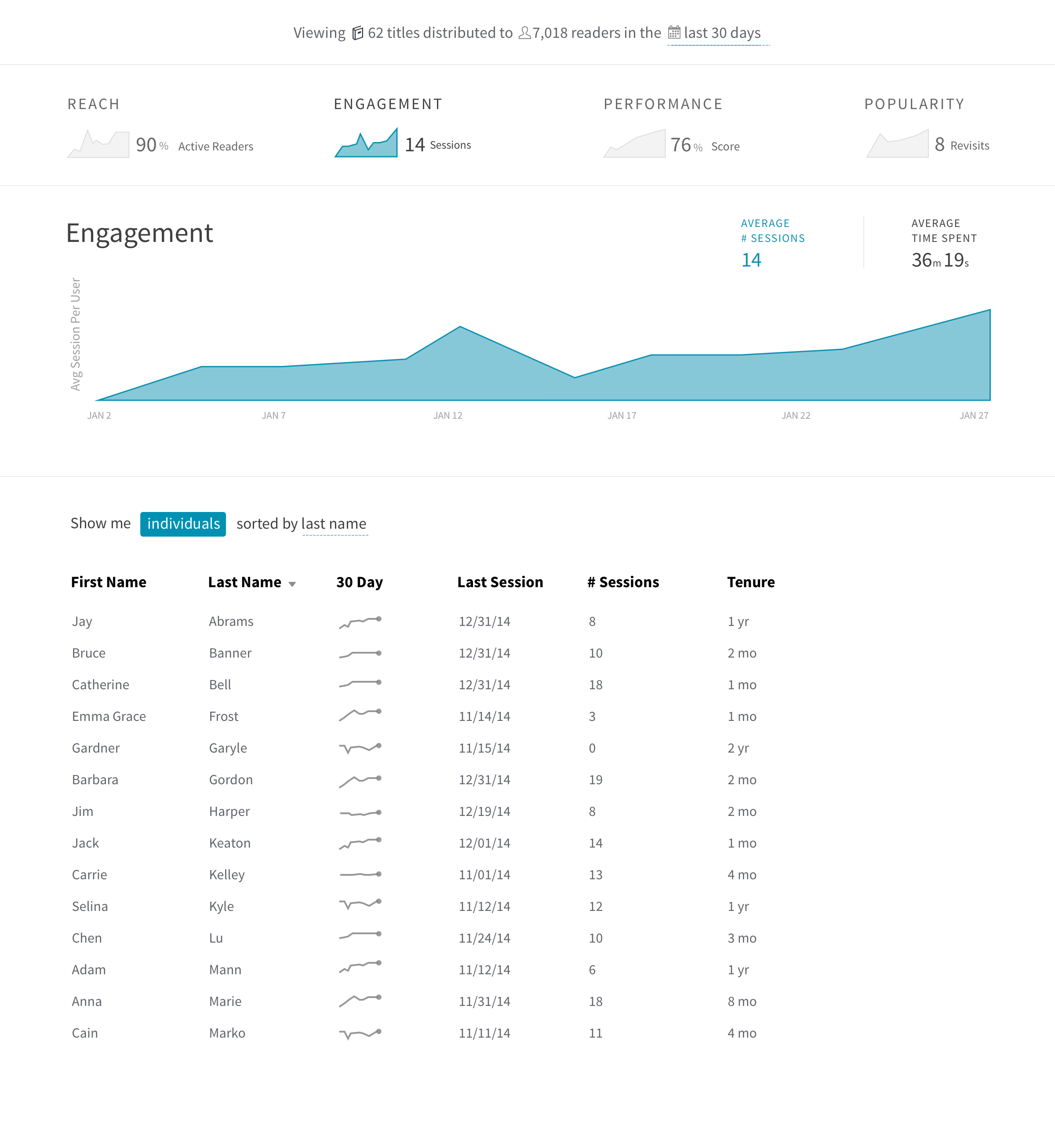
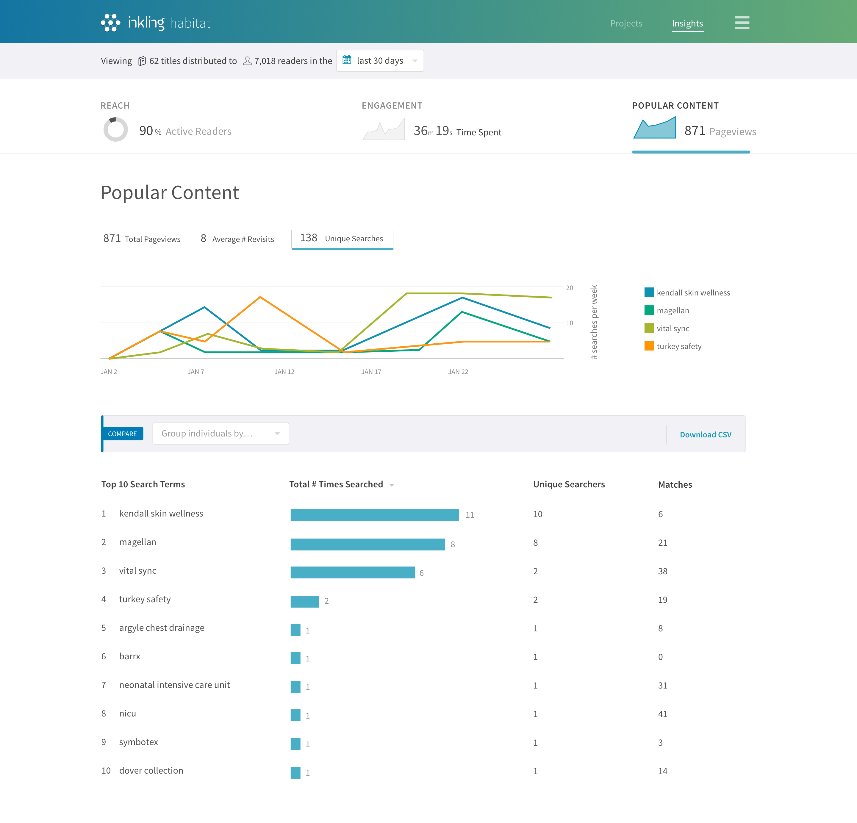
Design Output
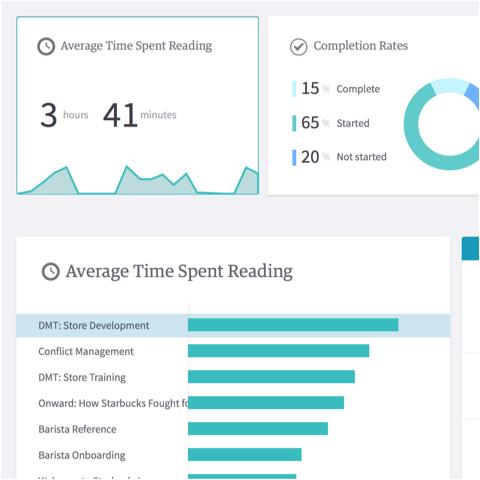
The final output of the design focuses on one key metric of active readership and allows users to filter to various metadata about users that they’ve provided to Inkling.


Focus on active readers
We narrowed scope to focus on the fundamental metric of active readers. Every customer has this data and would benefit from it either as a new customer or a long standing one.
Group by custom data
Across almost all customers, we heard a consistent need to compare activity across different groups of people. Many wanted to group by: geography, role, and department.
Download raw data
While our users valued seeing analytics within Inkling, they also needed the ability to integrate Inkling data with other business data that Inkling didn’t have access to. So, we included a link to download a raw CSV.
Filtering titles
Users needed a quick way to select Inkling titles they wanted to see data for. After a dozen other concepts, I landed on this auto-complete list and created a detailed spec for each state.

Date selection
Users also needed a quick and easy way to choose dates or a date range. This concept includes a fast way to select common ranges like the “last 7 days.”

Continued Work
Future Opportunities
We’re still learning about the user’s evolving data needs and how Inkling fits into their business intelligence strategy. Our sales teams and customers success teams are working with prospects and customers to evaluate their data needs.
Evolving Metrics
As customers gain more users and more data, different metrics become more valuable. Search metrics, for example, will let content creators know what unwritten topics are most desired.
Improving the Process
This unique and challenging project gave us insight into how to design data products for our customers. While not perfect, we now understand the importance of data prototyping early with sample data.