Overview
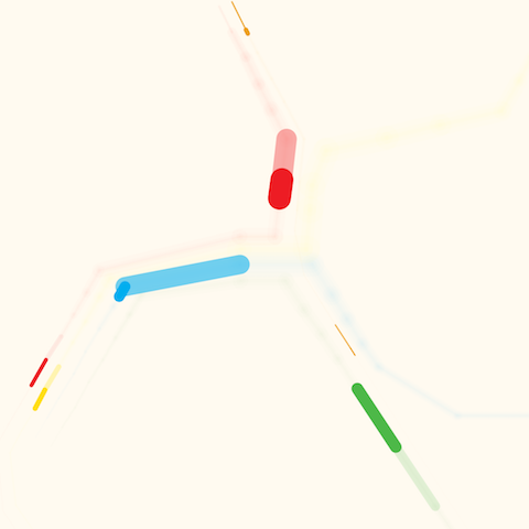
Transit Flow is an experiment using D3 and BART data to explore how Bay Area transit ridership changes throughout the day.
Tools
HTML/CSS, JS, d3.js, BART ridership data, Sketch
Project Home
Visualizing BART Ridership Data
This project began as a desire to tell a narrative about the city around me. So much of our surroundings, relationships, and interactions go unnoticed even though we experience them everyday. I think the way people interact with urban infrastructure can be at the heart of these stories.
As cities continue to grow and think about what smart, sustainable development means, it seems especially important to look at issues from both a quantitative data lens as well as a human narrative.
View the project in browser (requires desktop Chrome)
Transit Flow was featured in The Atlantic's City Lab, a publication focused on stories about the cities of the future — and those who want to live there.