Overview
In roughly two months, we designed and built a feasible solution that would seed the growth of one of the most powerful web-based data visualization tools out there.
Role
As the core of design at DataPad, I was responsible for initial research, design principles, early concepts, interaction details, and visual design.
Goals
I aimed to maintain a balance between flexibility in expressing data (i.e. "expressiveness") and ease of use for both beginners and experts. Our longer vision sought to empower anyone to explore data at the speed of thought.
Charting

Before my time
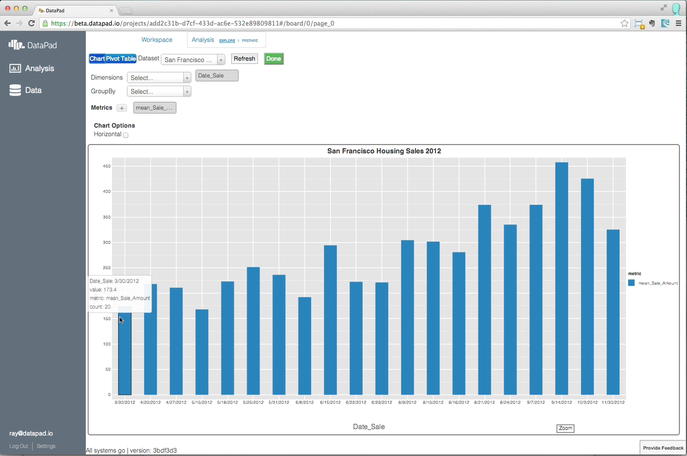
Before I put my hands into the product, the team had a rough prototype built — a "pipeline to the backend" as I recall our CEO, Wes, humbly describing it.
Light Research Into Existing Charting Tools
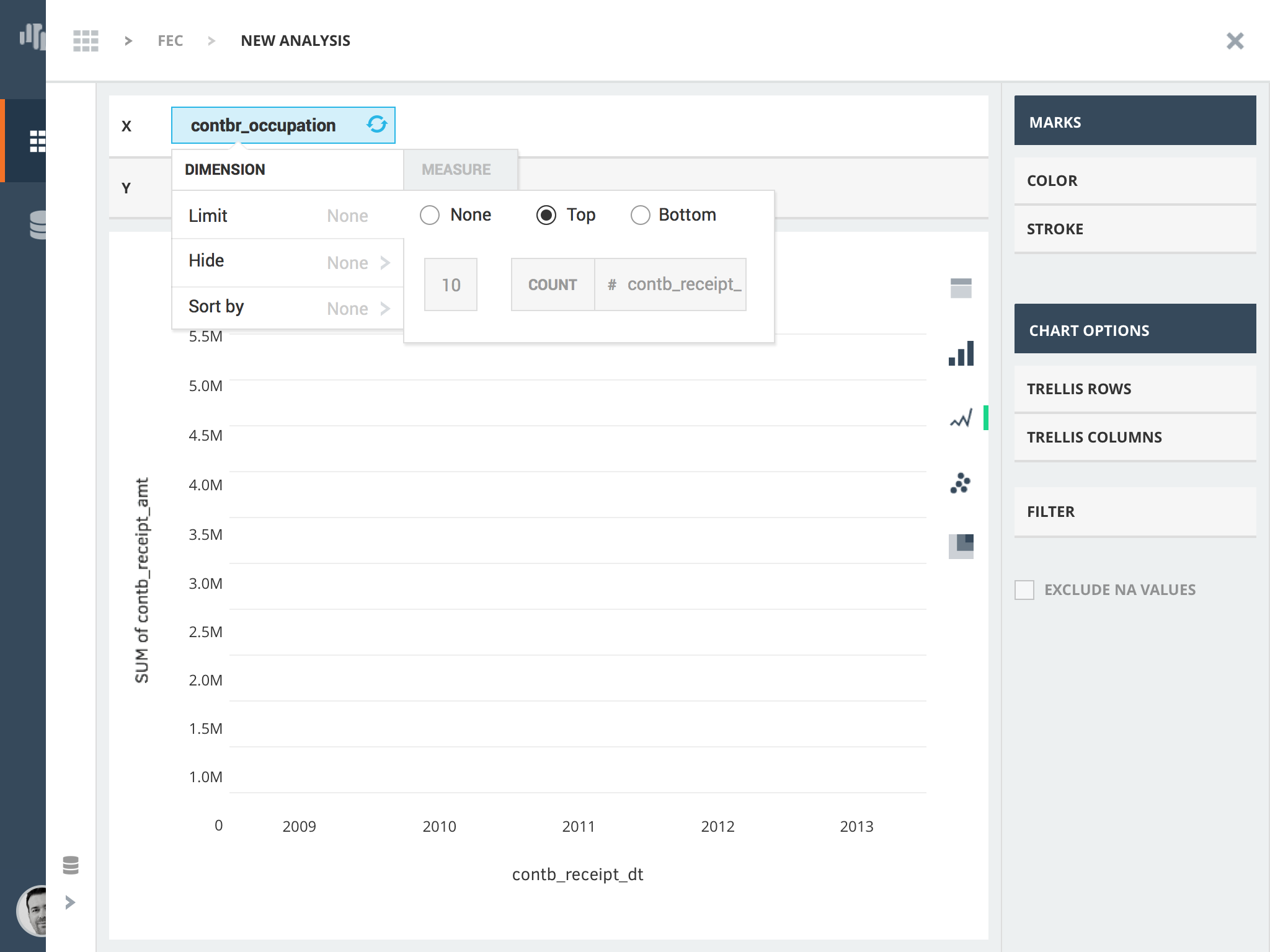
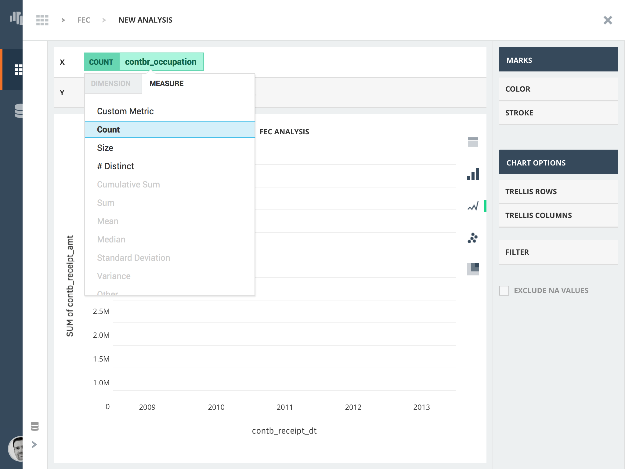
I started the process with some academic reading, exploration of existing charting tools, and discussions about what's best for DataPad. The most important overarching finding was this:
Many existing visualization tools focus too much on helping users decide what the data should look like versus helping them explore answers to their business or research questions.
As business and research questions become more complex, it becomes more important for tools to automatically make the basic decisions (e.g. what colors should I use to represent different countries? or should I use a line chart or a bar chart?). Of the existing visualization tools I looked at, only a handful came close to addressing this kind of problem: Tableau, Lumira, Platfora, and Microstrategy. In the end, we borrowed from Tableau's visualization principles, but remained consistent with both DataPad's visual design language and existing charting engine.
Initial Concepts
After initial review of existing tools in the market, I began exploring rough concepts through sketching and visual mocks.
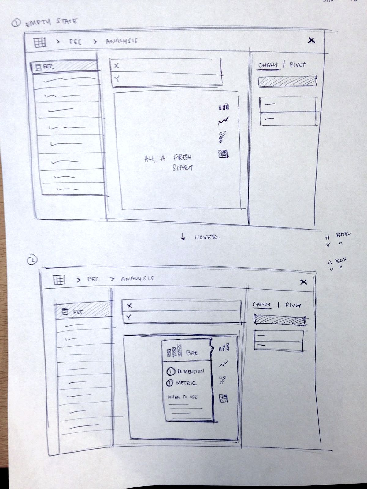
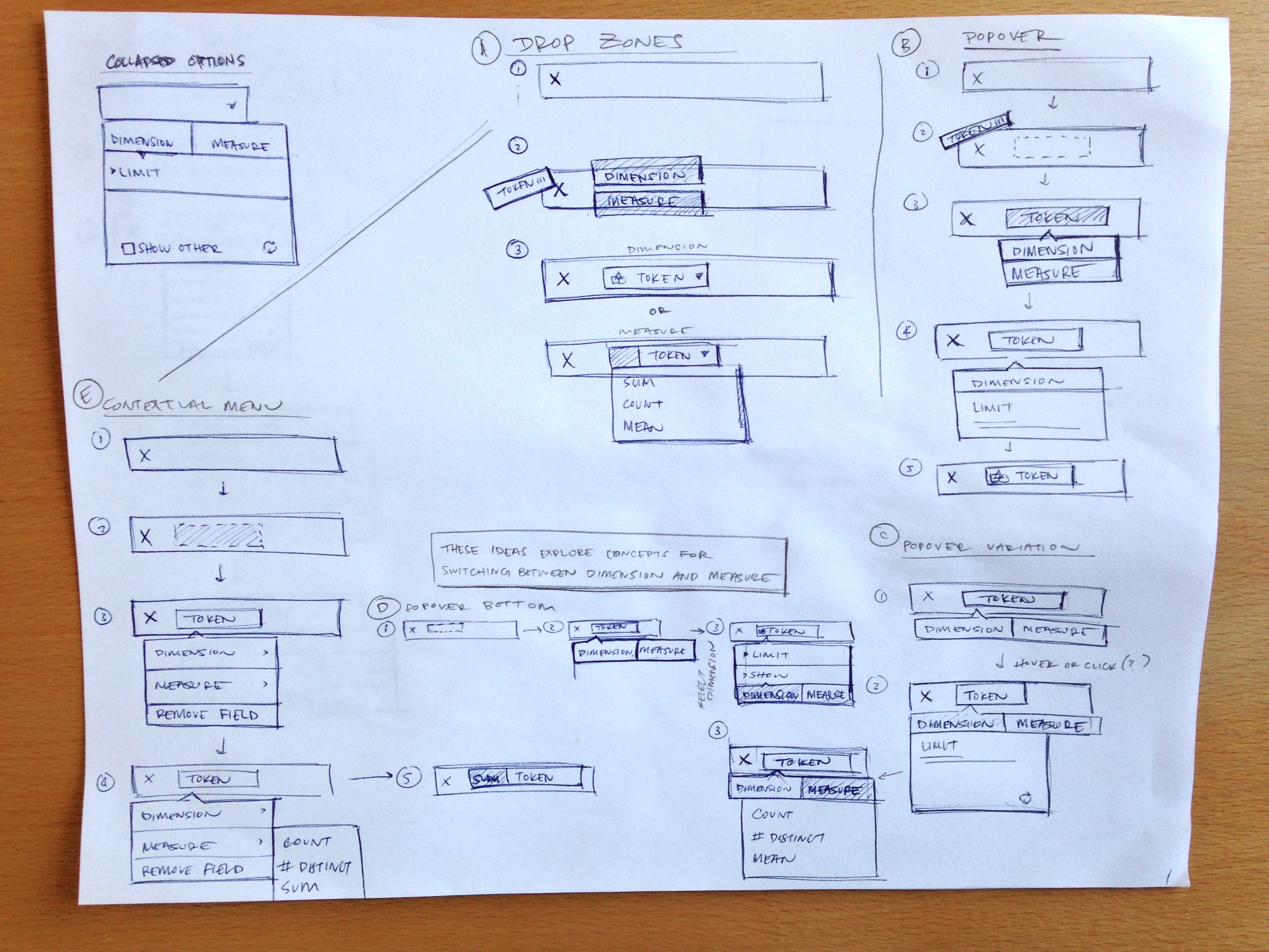
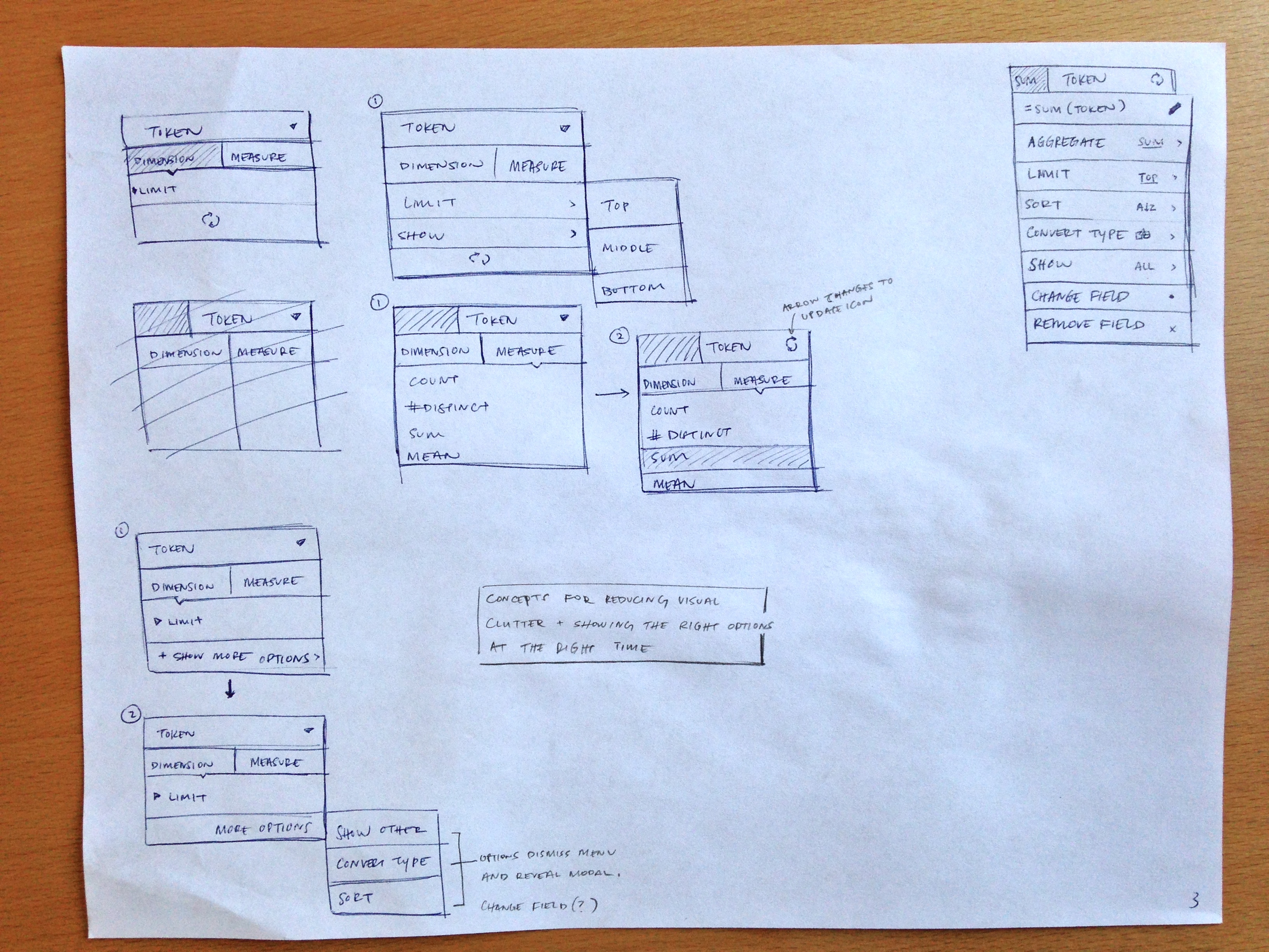
Sketching Microinteractions
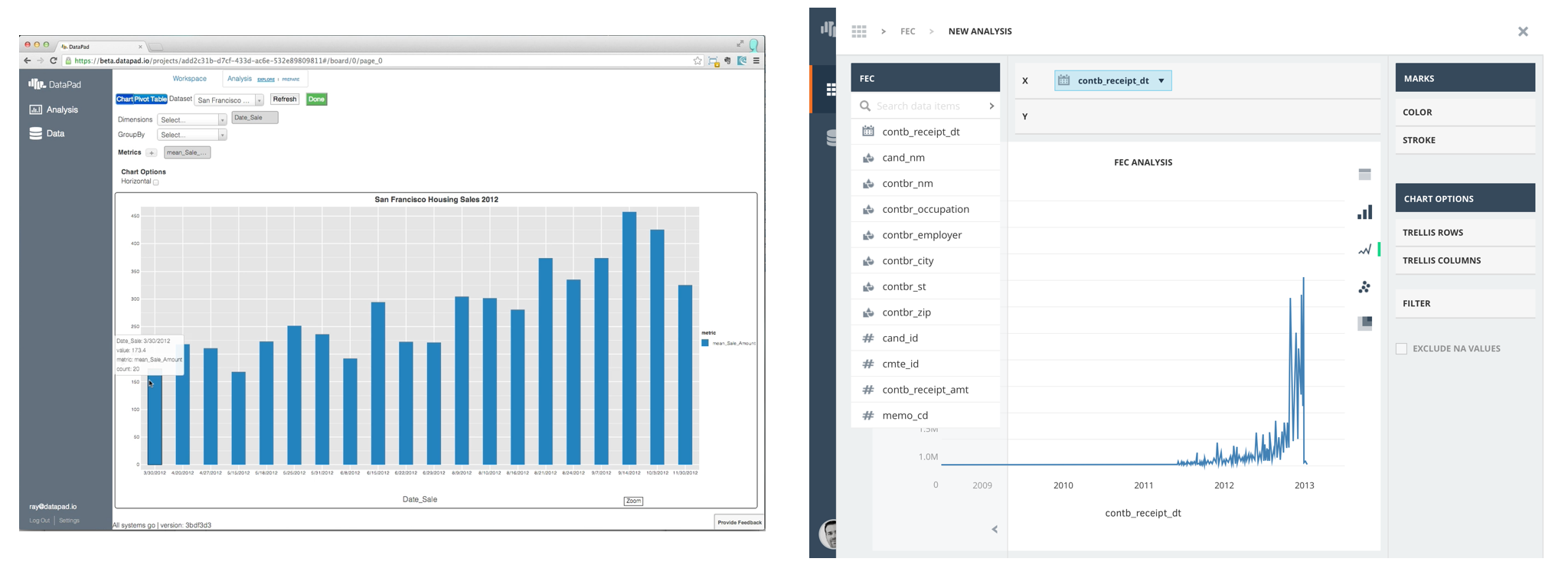
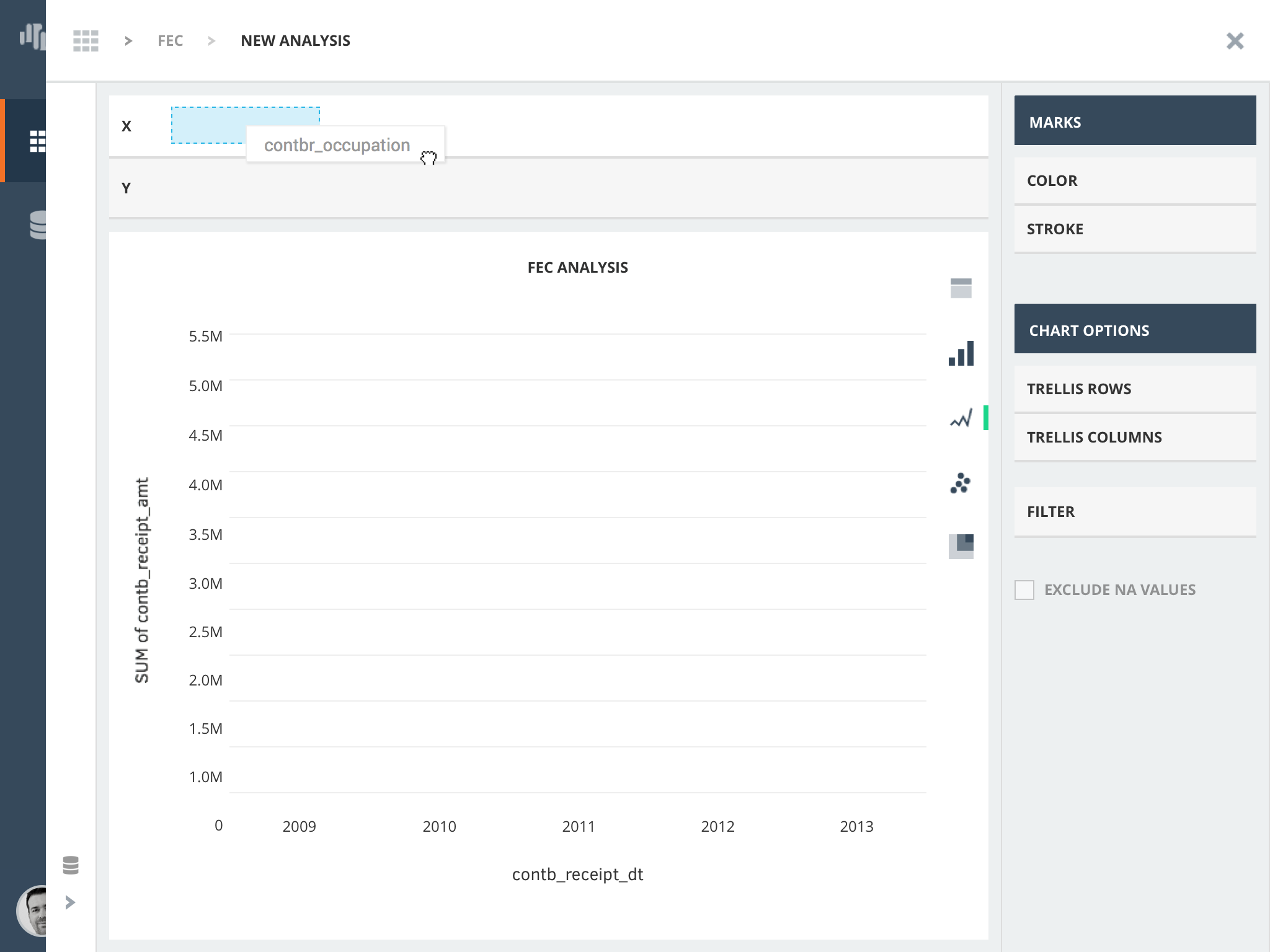
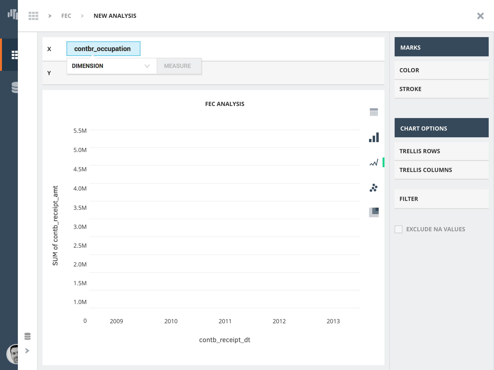
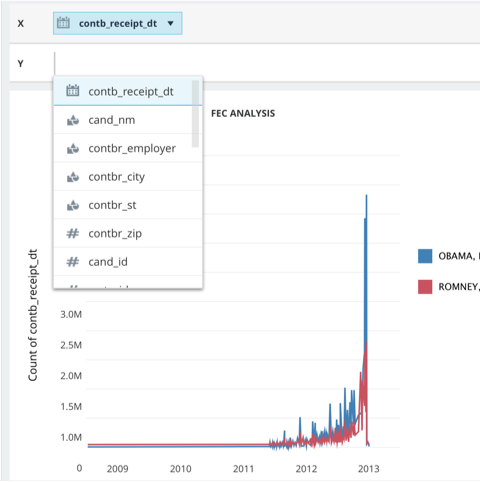
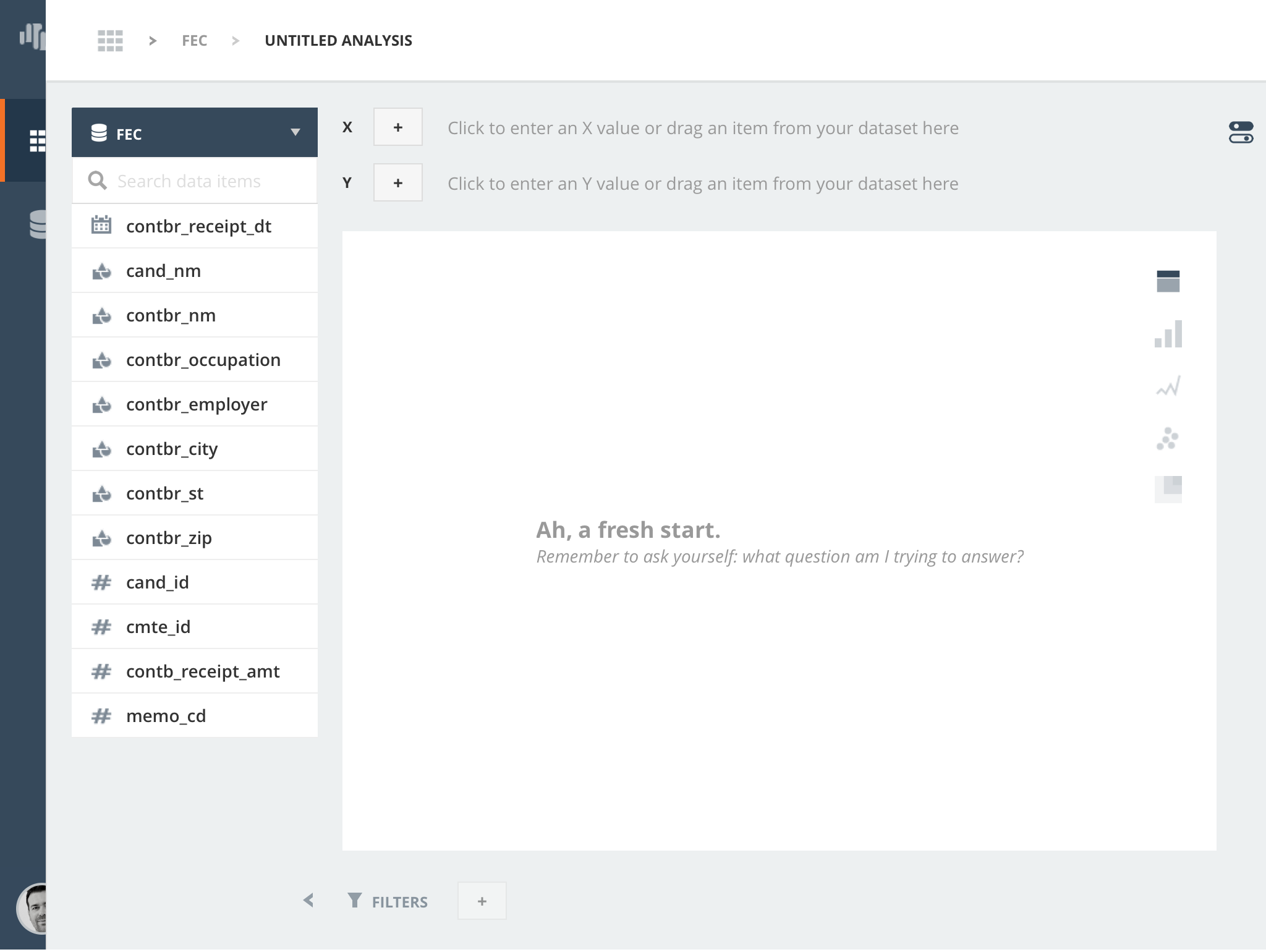
As the product progressed, we discovered new needs like letting users specify whether a token was a dimension (independent variable) or a measure (dependent variable).
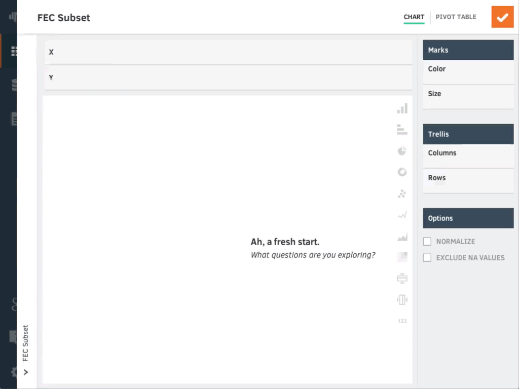
Charting a Path to Success
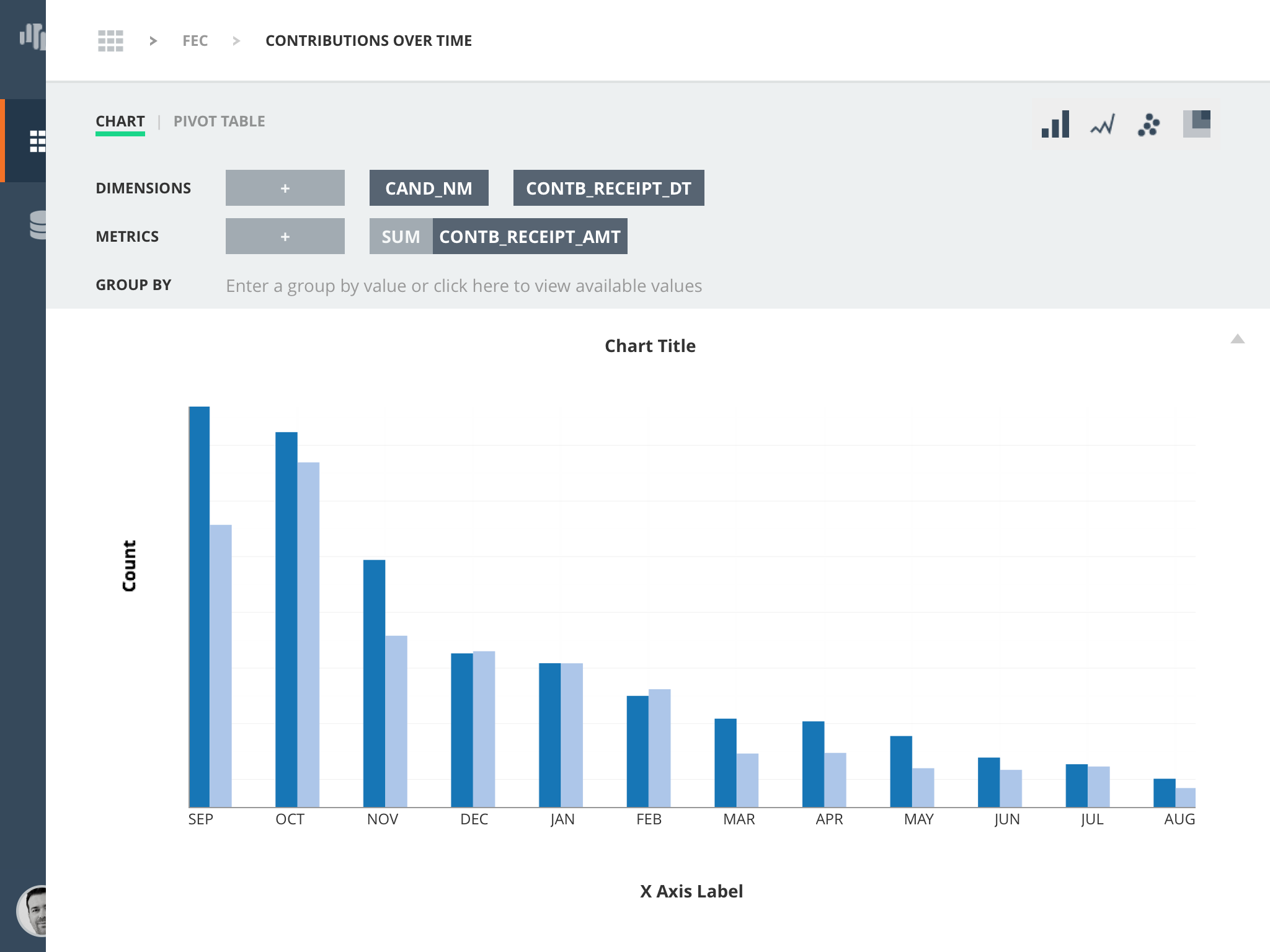
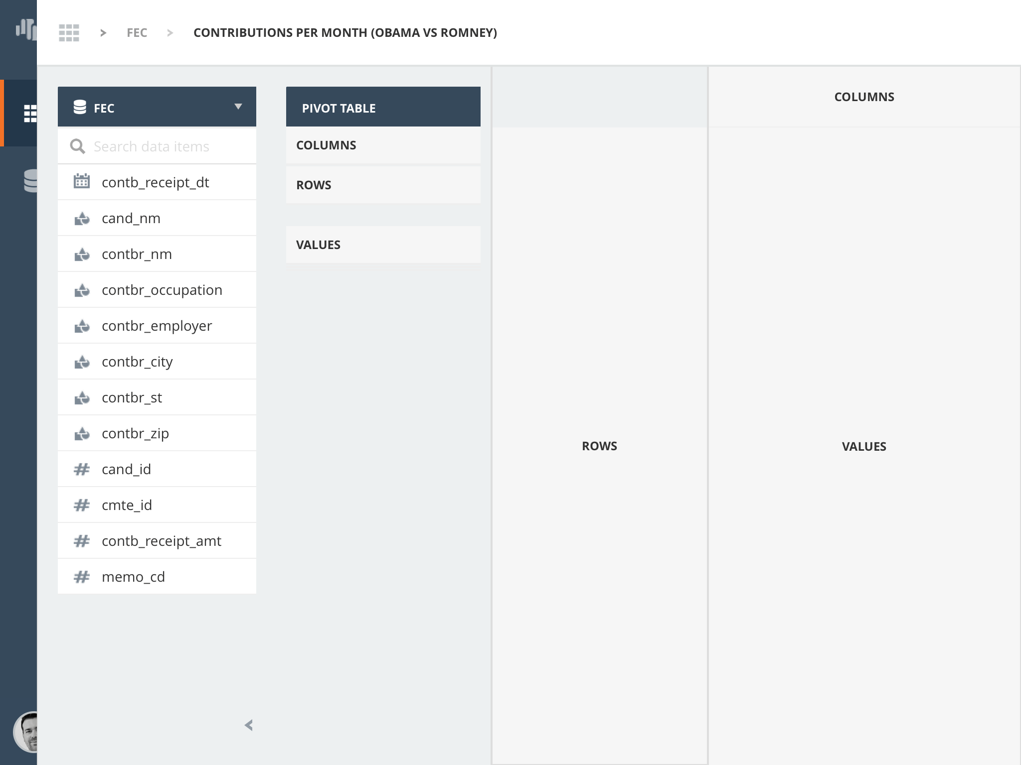
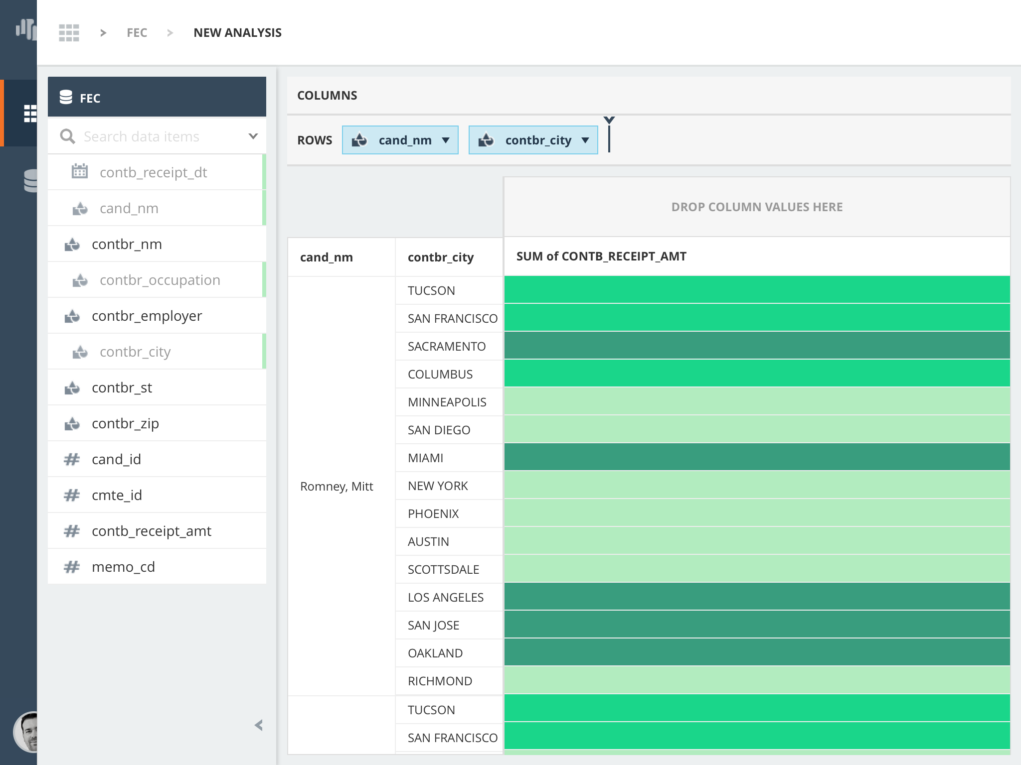
Design had set out to build the foundation for a web-based charting tool expressive enough to visualize data in different ways and explicit enough that results were predictable for both beginner and expert users. While we did not have the opportunity to conduct extensive testing on the tool, the informal sessions we did have with users gave us some insight to how we should have progressed. Some users tried to create certain visualizations that were not yet feasible. To design around these limitations, tooltips for existing and "coming soon" chart types might have helped. Online support or a feature request would help keep track of what types users might need (we used Intercom for this).
The main issues with DataPad's charting tool were associated with its unpredictability. Our charting engine was making some assumptions about how to best represent plotted data. While we were well on our way to making better assumptions and forming a more consistent framework for how data gets plotted, we did not manage to get there in the final cut. If design had continued, one key improvement would have included a tooltip wizard for each chart type (not unlike Tableau's) to guide users in making better visualization decisions.


