Overview
Create a basic onboarding flow for new users.
Role
I completed an end-to-end design process starting with research of existing patterns, flow diagramming, sketches, prototyping via InVision, user testing.
Goals
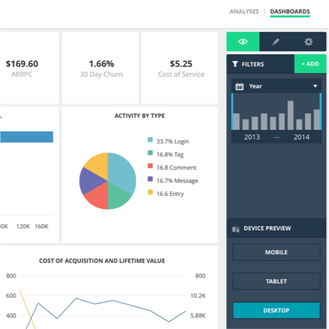
- Help users get to the most valuable parts of the app in less than 4 minutes. For this round of design, I chose the charting tool as the most valuable part of the app.
- Allow users to quickly connect and share data.
- Teach users how to use DataPad to achieve their business goals.
- Allow users to watch a brief video at some point to learn more about how to use DataPad.


Onboarding from Ray Luong on Vimeo.

My Process Began With Research
To begin my work on onboarding, I compared onboarding designs from a variety of web products. Since there were nearly an infinite number of ways to onboard users into a web product, it was important to be mindful of what these products were optimizing for and how their pieces might integrate with DataPad's onboarding. The following were recurring themes I picked up throughout all the products I evaluated:
-
How might we teach users how to use the product using the product itself (i.e. without a manual)? This is challenging for a product (enterprise or social) that has no users and no content. Almost all web products show placeholder elements (dotted line boxes) for empty content. Almost all web products use sample content. An old version of Basecamp, for instance, uses a sample project to show users what projects are used for. For DataPad, it was providing sample datasets to analyze.
 Starting users off with sample datasets. This proved to be immensely useful for users, who generally didn't want to dig around for a small dataset to play with.
 -
How might we show value as soon as possible? Many products were able to onboard users and show the most useful bits in less than a minute. I'd venture to say it's easier to do this for simpler products. Trello takes you right away to the basic interactions of creating boards using its own product. It's much more effective to show value at the same time you're teaching users how to use the product. For DataPad, it was important to gather minimum information and show them our strongest feature: charting.
 Hand holding to the most valuable part (charting). We nudged users to start creating charts right away since this was the most powerful part of DataPad's product.
 -
How might we do the above without getting in the way? Good onboarding designs ask for the minimum amount of information from the user in order to provide the best tailored experience for the rest of their journey. They allow scaffolds to fall away at the right places. They let the users who know what exactly what they want to do to have their freedom. For others, they provide the right balance of options in the beginning and user test as the product evolves.
 Providing minimal options. We made some initial assumptions about what users wanted to do, then tested.
Rapid Sketches for Rough Flows
With an idea of what options we had for onboarding, I continued by diverging into a few different visual flows for what the user would see from initial invitation to entering the web application.


Flow Diagrams Were Key in Specs
The following flow diagrams were crucial in making sure every edge case was accounted for. Uninvited users for existing organizations, for example, needed additional design and development work that we did not uncover until illustrating this flow.


Prototype Testing With Users
As soon as I built a clickable prototype via InVision, I rounded up a handful of prospective users who had subscribed to our beta program. My basic selection criteria were: (1) based in San Francisco, (2) works in a small team of less than 15 people, (3) not a competitor, (4) actually exists. After drilling down via MailChimp and Google Refine, I was able to put together a list of representative candidates for user testing.
I'd discovered several key insights just from brief conversation and through think-aloud testing.
-
A majority of users who hadn't seen the product were going to benefit from what we had already built.
"What I need to do is make data accessible to our data scientists and some business users in charge of marketing and overall user experience of the app. That transition has been overall clunky for us — nothing robust enough for data scientists and easy enough for the business people." — Chief Product Officer
People wanted to quickly test DataPad using demo datasets before they committed to any pricing plan or invitations.
"I want to get familiar with the tool, what does it look like. So, maybe that would be better with a familiar dataset but oftentimes it’s not that often that we just have a small dataset that’s ready to be loaded into something like this. It would take me like 10-15 minutes to think of a sample dataset to throw in here." - Data Engineer
"I think that having 2 options on this screen might be a little confusing. I think that having someone get started with their own data as early as possible within the process is smart because you’re getting them more looped into the product and they see their own data and everything but my first inclination would be to see how it works. That’s what I would want to do first. I wouldn’t necessarily have the right dataset to start out with or want to start out with." - Marketing Analytics Manager
- Permissions settings were important for users who had sensitive business data.
Users and Team Were On Board In the End
Although the final designs presented here were approved for development, our team did not have the opportunity to implement them in time. We concluded our design process with prototype testing, which confirmed some of our assumptions and debunked others. The most important finding that dramatically changed design direction indicated that many users were already testing other products similar to DataPad and thus wanted a quick onboarding process that allowed them to quickly check to see if there was a fit for their company's needs.
If time allowed for additional design, I would (beyond testing) include passive tooltips that briefly highlighted the possibilities of the app, not unlike what Slack does in their onboarding. One drastically different idea left unexplored was an idea to immediately bring users into the app (without asking for any information) and showing a minimal amount of tooltips to guide the user. Although this would have been at the cost of more dollars spent without any sort of commitment, it could have revealed much more about key features within product itself.